GIS data visualization
Back in the day when I first coded, I’d want to simulate the reality with different effects like how gravity’d slow down the upward movement, how the light hit the ball. My preferences start to change toward something else different. Instead of simulating the phenomenon to the detail, I tend to look at the bigger picture, uncover the pattern, tell a story about it. That’s how I ‘switch gears’ to data visualization.
Beyond plot, I’ve learned about different types of data visualization: network, graph, flow maps in 2D, 3D or even 2.5D. I discovered GIS, the whole sector with different tools dedicated to handle spatial data like geoJSON, geodatabases, shapefiles.
GIS tool: shapefiles and ArcGIS Pro
Shapefiles, created by Esri (the Microsoft of GIS), are industry standard file for storing geographic information. It became the industry standardis a combination of three files: feature geometry (shp), shape index position(shx), attribute data (dbf). It is structured like a database consists of different models. shp file stores information about every coordinates of points, organized by multiple segments. Shape index position (shx) identifies these segments through pointers. Attribute data (dbf) file stores attribute such as name, surface type,.. about these segments. These three files are useless without one another. But together, any map software (ArcGIS, QGIS) can read shapefile and display the map.
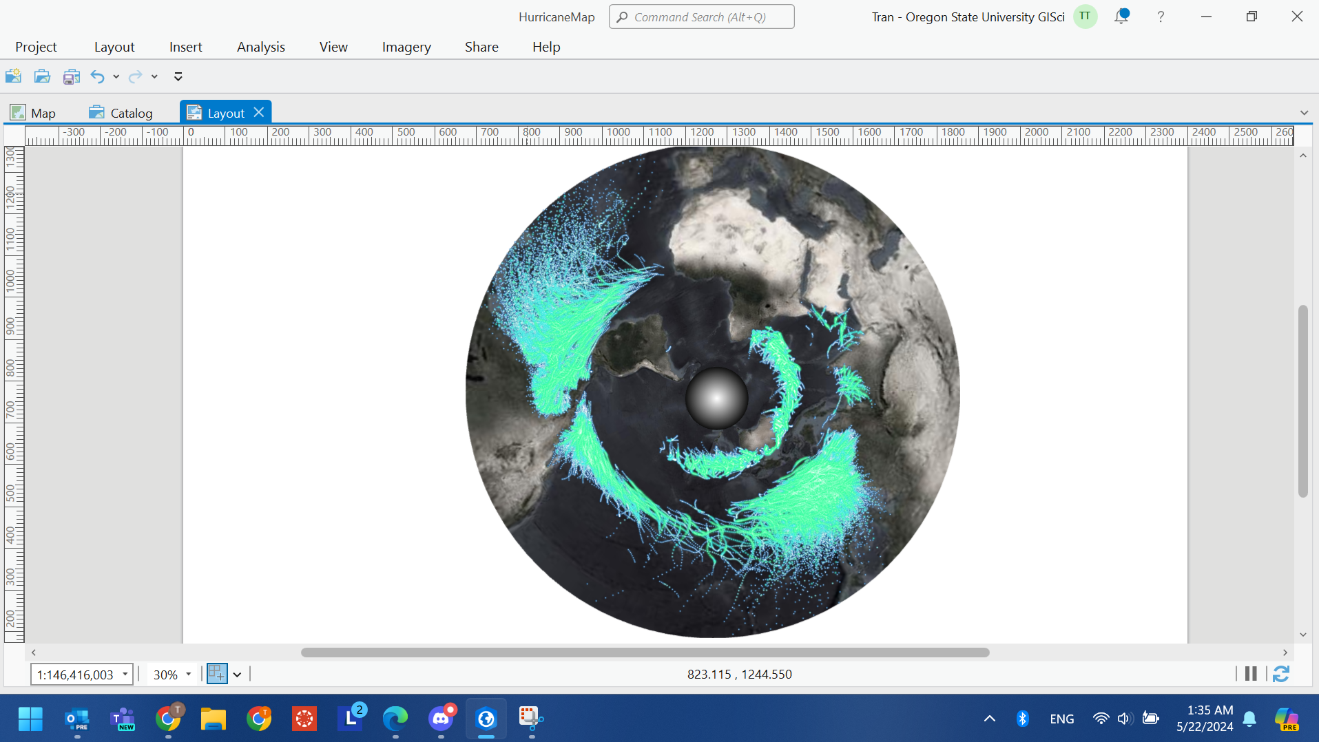
Here comes ArcGIS Pro, the tool used by every GIS professions. The software is nowhere to be replicated. It is intuitive to learn especially for non-technical people. I made this visualization of Hurricane Map on stereographic South Pole projection (following John Nelson’s tutorial).
I applied the same method to visualize wildfire dataset accumulated over 7 days and this is the result. In this visualization, wildfire’s detection confidence level is reflected with different shades of red while the purple surroundings represent fire radiative power.
Here is the result:
Connection to the project
During my presentation about this visualization to people who went to the public art walk, most of the reactions I received were concerns, surprises. Though this exaggerate what is happening over the red color or the size of the dot, it achieves its purpose of reminding people what could be happening.